Yaquot entered a competitive jewelry market with no defined identity. The challenge was to create a brand that communicates elegance, exclusivity, and timeless beauty, while standing out in a space where perception defines luxury.
result
Results & Metrics
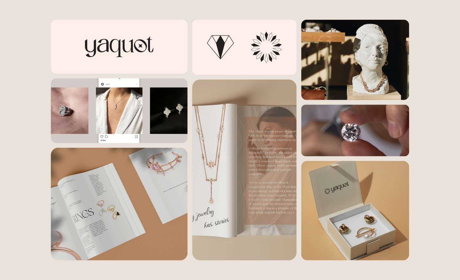
Yaquot launched with a polished and distinctive identity that positions it within the luxury jewelry segment. The brand achieved a consistent and recognizable look, allowing it to communicate its value and craftsmanship effectively. This identity creates a strong foundation for brand growth and long-term positioning.
33%
Ad performance efficiency improved by
40%
Social media interactions grew by
65%
Brand recognition increased by
97%
Increase in overall revenue since switching to CTRL B
improvements
Findability challenge
The brand lacked a consistent visual presence across its digital touchpoints, making the experience feel disconnected and less memorable for users. The previous identity relied on generic design elements that didn’t fully communicate the company’s personality, values, or positioning in the market.
Identity system
The brand lacked a consistent visual presence across its digital touchpoints, making the experience feel disconnected and less memorable for users. The previous identity relied on generic design elements that didn’t fully communicate the company’s personality, values, or positioning in the market. Our goal was to create a stronger and more recognizable brand system that would elevate perception, improve consistency, and build a clearer emotional connection with the audience across every interaction.
Brand positioning
The brand lacked a consistent visual presence across its digital touchpoints, making the experience feel disconnected and less memorable for users. The previous identity relied on generic design elements that didn’t fully communicate the company’s personality, values, or positioning in the market. Our goal was to create a stronger and more recognizable brand system that would elevate perception, improve consistency, and build a clearer emotional connection with the audience across every interaction.
Strategic direction
The brand lacked a consistent visual presence across its digital touchpoints, making the experience feel disconnected and less memorable for users. The previous identity relied on generic design elements that didn’t fully communicate the company’s personality, values, or positioning in the market. Our goal was to create a stronger and more recognizable brand system that would elevate perception, improve consistency, and build a clearer emotional connection with the audience across every interaction.