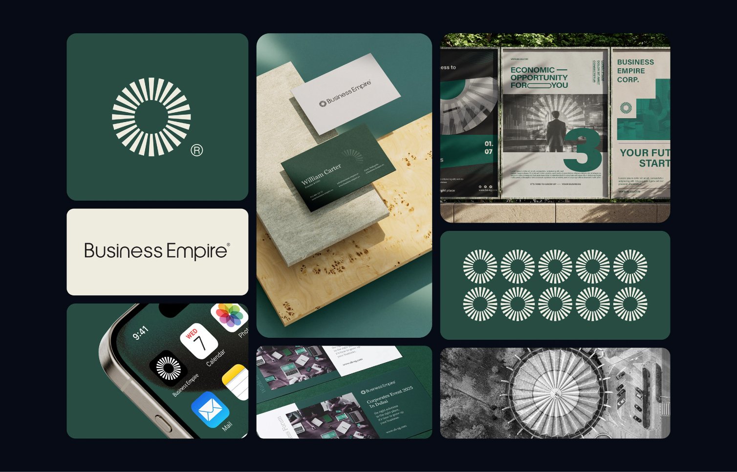
Business Empire entered a crowded consulting market with no visual identity. The challenge was to build a brand that communicates authority, trust, and professionalism, while standing out in a space where credibility defines success.
result
Results & Metrics
We deploy world-class creative design, team on demand. that can design surest measure’s of success is when a client partner with more than once build, ship scale your vision most efficient. Visual hierarchy is the principle of arranging elements to show their order of importance. information easily. By laying out elements logically and strategically, designers influence users’ perceptions and guide them to desired actions. Users notice larger elements more easily can convert.
4+
years of experience
30+
Brands They Made
33%
Brand positioning clarity increased by
62%
Increase in overall revenue since switching to CTRL B
improvements
Findability challenge
The brand lacked a consistent visual presence across its digital touchpoints, making the experience feel disconnected and less memorable for users. The previous identity relied on generic design elements that didn’t fully communicate the company’s personality, values, or positioning in the market.
Identity system
The brand lacked a consistent visual presence across its digital touchpoints, making the experience feel disconnected and less memorable for users. The previous identity relied on generic design elements that didn’t fully communicate the company’s personality, values, or positioning in the market. Our goal was to create a stronger and more recognizable brand system that would elevate perception, improve consistency, and build a clearer emotional connection with the audience across every interaction.
Brand positioning
The brand lacked a consistent visual presence across its digital touchpoints, making the experience feel disconnected and less memorable for users. The previous identity relied on generic design elements that didn’t fully communicate the company’s personality, values, or positioning in the market. Our goal was to create a stronger and more recognizable brand system that would elevate perception, improve consistency, and build a clearer emotional connection with the audience across every interaction.
Strategic direction
The brand lacked a consistent visual presence across its digital touchpoints, making the experience feel disconnected and less memorable for users. The previous identity relied on generic design elements that didn’t fully communicate the company’s personality, values, or positioning in the market. Our goal was to create a stronger and more recognizable brand system that would elevate perception, improve consistency, and build a clearer emotional connection with the audience across every interaction.